

Logo Redesign
Aspect Tree Care
Aspect Tree Care is a Reno, NV-based company that approaches tree health in a holistic, science-backed manner. After obtaining the highest level of certification for arborists and becoming an ISA Board Certified Master Arborist, the owner wanted to update their branding to reflect this change. Because of the specialized nature of their work, we needed to convey a sense of sturdiness and trustworthiness. I created a new logo and helped them implement it across their website, staff uniforms, and company vehicles.


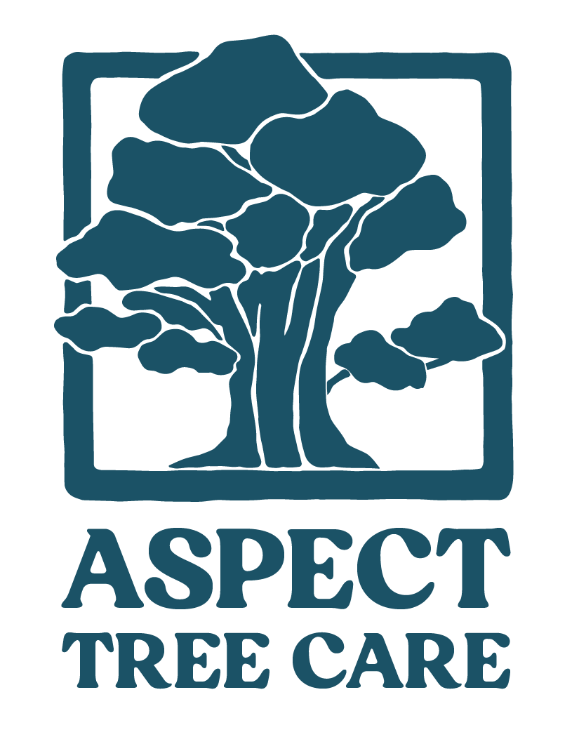
When designing the logomark for Aspect, we discussed a few tree species options before settling on a Sierra juniper. Ubiquitous in the mountains of western Nevada and eastern California, it’s a beautiful and hardy tree that can withstand harsh climates. Although Aspect Tree Care works primarily in a city, its mission centers around caring for the urban forest ecosystem.
Reminiscent of traditional maker’s marks, I placed the tree within a thick border whose edges are slightly imperfect, as if this could be a stamp carved from wood. It also makes it easy to reposition the mark in different configurations with the logo text or to be used independently from the text, such as for stickers and t-shirts.
Letting the juniper’s branches break into the border and extend just beyond the edges was a decision made to show that Aspect’s type of tree care is about helping the tree be its healthiest version of itself in its natural form.

While most tree care companies choose a true green for their logo, we went with a deep teal- somewhere between a blue and a green. Aspect’s first logo was a sky blue, and we wanted to harken back to that initial branding while making it more mature and grounded.

The process began with a hand-drawn and painted version of the tree. The less-than-perfect nature of the juniper felt best captured by a physical medium as opposed to a digital one.
Learn more about their work here: